
FASE Research Lab
A cutting edge university research lab that works to improve outcomes for underserved communities has a website that needs to better reach its users.
Background
FASE conducts research about children with autism from underserved Spanish speaking populations. Their website was limited and hard to understand. Potential interns were getting lost trying to contact the lab and administrators and colleagues weren’t getting a full picture of their work. This led to missed opportunities for collaboration, and problems recruiting potential interns to work at the lab.

The Details
Role Lead Researcher & UX Designer
Team Myself, Stakeholder, Research Intern
Tools Figma / Procreate / Miro / Maze
Timeframe 4 weeks

Design Process
How might we help a university research lab’s website meet the needs of multiple audiences and reflect the immigrant population they work with?
User Research
Initial research led me to interns, university colleagues and administrators as the main users of academic websites.
What were their goals, needs and frustrations? I surveyed 20+ current users of Fase’s website and conducted 15 follow-up interviews to find out.

An affinity map helped me organize and find insights from the research.
Key Findings
80% of total users
wanted to see the researchers current work highlighted.
50% of interns
Struggled to find a way to contact the lab.
100% of total users
went to a lab’s website to understand their research areas and methodologies.
75% of interns
Went to the lab website to find ways to get involved.
60% of dept. heads
were frustrated by the functionality of researcher websites (too much text, not updated, unclear descriptions)
60% of colleagues
wanted to see publications on a faculty research website.
Comparative Analysis
My research of five competitors showed that overall academic research lab websites are text heavy. Most sites are not visually cohesive and lack clear task flows. To tackle this problem I analyzed the way other labs present their work.
How do other university labs share their research effectively?
Problem: Competing sites do not have intentional UI.
Solution: Focus on improvements to the FASE UI.
Key Findings
Problem: Publications/research section is long and wordy, and hard to get at a glance
Solution: Incorporate summaries and use linked studies instead of embedded text in the pages.
Problem: Competitors struggle to meet the needs of multiple target users
Solution: Make clear personas for each group and user flows for each persona.
Personas
What are the priorities of three different user groups?
David The Department Chair
Explore the current work of department colleagues.
Research potential job candidates
Amy The Colleague
Explore the current work of colleagues.
Look for potential collaborators
Katrina The Grad Student
Find information about the labs primary researcher
Contact the lab for job opportunities
User Flows
Multiple goals, multiple user flows
Important shared user goals we discovered:
Contacting the lab
Seeing the lab’s current work
Understanding the lab’s mission
Interns had additional questions they needed answered:
Did the researcher do work that aligned with their interests?
What were their publications?
How did they run their lab?
In the user flows I created, potential interns can go straight from the landing page to About Us, where they can access information about the lab and its current researchers including links to their related sites like Researchgate and Linkedin.
Wireframes
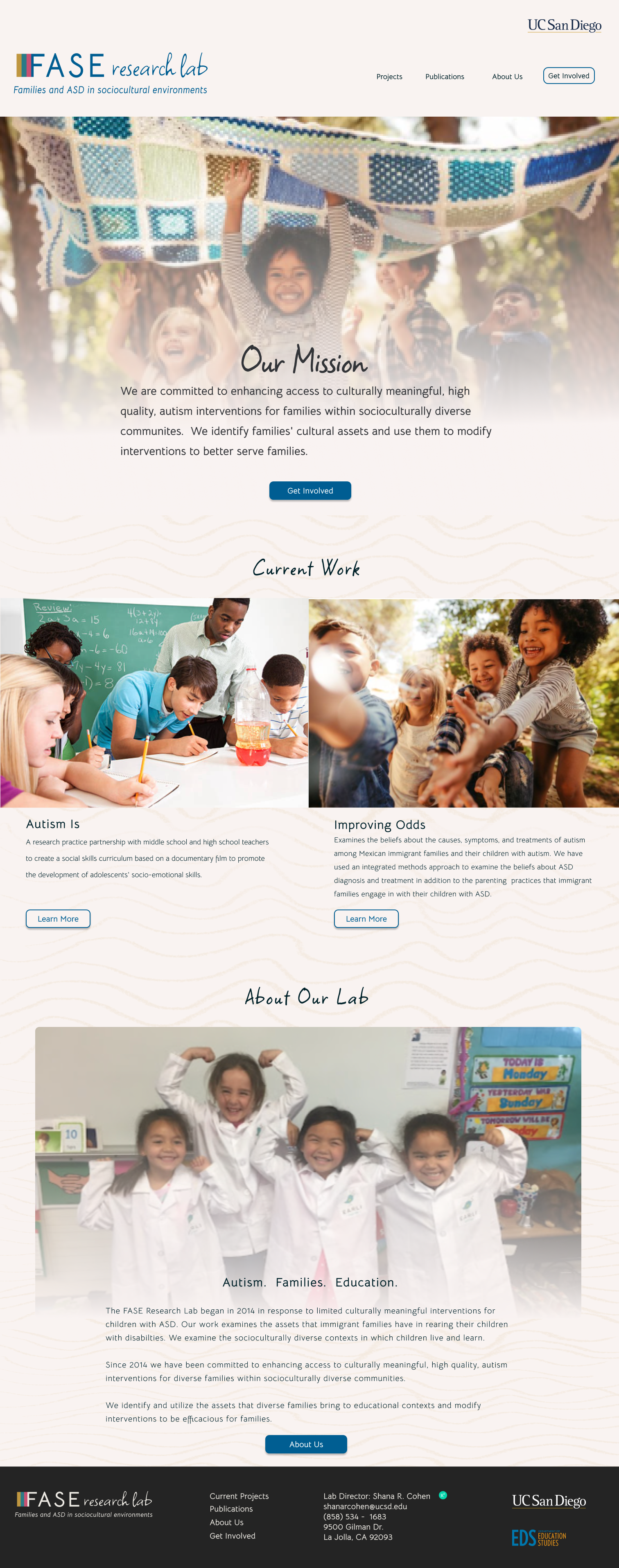
Incorporating compelling imagery with content that is text-heavy.
Feedback was consistent: research lab websites are too text heavy and lack imagery of the actual work being done. I opted for full bleed images throughout the site to surprise users.
Branding
A rebrand that speaks to the key population the lab works with: immigrant families who have children on the Autism spectrum. Collaboration, community and strength guided the design.
I worked with the original name (FASE) and looked to Latin American textiles for color inspiration. Later, I incorporated feedback from the client and included two typefaces, one bold and clean, and the other down to earth and friendly to give the logo a professional but welcoming look.
Before

After

Visual Design
A clean and simple look with an approachable feel.
To emphasize family and community, I used bright, saturated colors. I drew patterns and incorporated them in the sites background to keep the UI approachable and friendly. The photos represent an empowered family with culturally diverse subjects. A gradient overlay unifies the design and makes text easily accessible.
Usability Tests
Photos reflect the mission of the lab and carousels, links and columns improve readability.


50% of users struggled to find the buttons to complete particular tasks. To improve this, I changed most buttons into more traditional shapes, instead of using colored text.

Interns who navigated the site were looking for specific information. I added a dropdown feature so that they can view the full project poster if desired.

New Design

Before
After
Prototype

Impact & Outcomes
Met the needs of multiple groups of users with varying objectives. I did this by meeting regularly with the stakeholder to understand and prioritize user flows.
Created more accessible and usable content through a more balanced image-to-text ratio and condensing academic research articles using drop downs and links.