
Shelter Insurance
Responsive design for quick and painless insurance quotes.
Background
Shelter is an insurance company and has been in business for several decades. Shelter’s goal: reach a new demographic of consumers through a new responsive website that allows them to sell direct to consumer.

The Details
Role Lead Researcher & UX Designer
Team Myself
Tools Figma / Procreate / Miro / Maze
Timeframe 8 weeks

Design Process
How might we create an effective way for new users to find and purchase their insurance plan online?
User Research
What do users need to see to successfully purchase insurance online?
Target demographic: 25-50 year old people who have purchased insurance for home or business. I interviewed 8 users to find out about their experience purchasing insurance.
What motivates users to purchase insurance online?
What draws them to use a particular company in the first place?
how can Shelter stand out from the crowd and make their insurance buying process pain free?
Key Findings
100% of users
Wanted a reputable insurance company that offered a good value.
100% of users
Use an app for basic tasks including accessing cards, paying bills and checking policy coverage.
50% of users
Did not use brokers and were overwhelmed by the choices when searching for policies online.
Competetive Analysis
I researched Shelters direct competitors, observing closely for design patterns, both positive and negative.
How do other university labs share their research effectively?


Problem: Larger companies get poor consumer reviews of customer service.
Solution: Focus user experience on quality customer service including chat option and phone number for available support.
Key Findings

Problem: Traditional color schemes with branding that emphasizes value and reliability are common among large insurance companies UI.
Solution: Help Shelter standout among competitors by using a unique but pleasant color scheme and simple but effective UI to express important values of usability and value.
Problem: Competitors struggle to differentiate themselves in a crowded market.
Solution: Make Shelters unique value proposition apparent from the start.
Persona
“Ultimately the products are all comparable so I look for a company that is responsive when I call and provides good service.”
Steve is a 44 year old father, husband and white collar worker. Steve takes pride in taking good care of his family.Steve is motivated by finding a good value, and finding a reliable company he can count on in an emergency. Steve gets frustrated by companies who change rates without warning and finds the insurance choices out there overwhelming.
User Flows
When users went through the flow for purchasing insurance, major pain points were:
Entering personal information
Selecting coverage without comparing coverage and prices with other companies
I knew I had to address these issues to increase conversion rates.
How could I get Steve through the conversion process without dropping off?
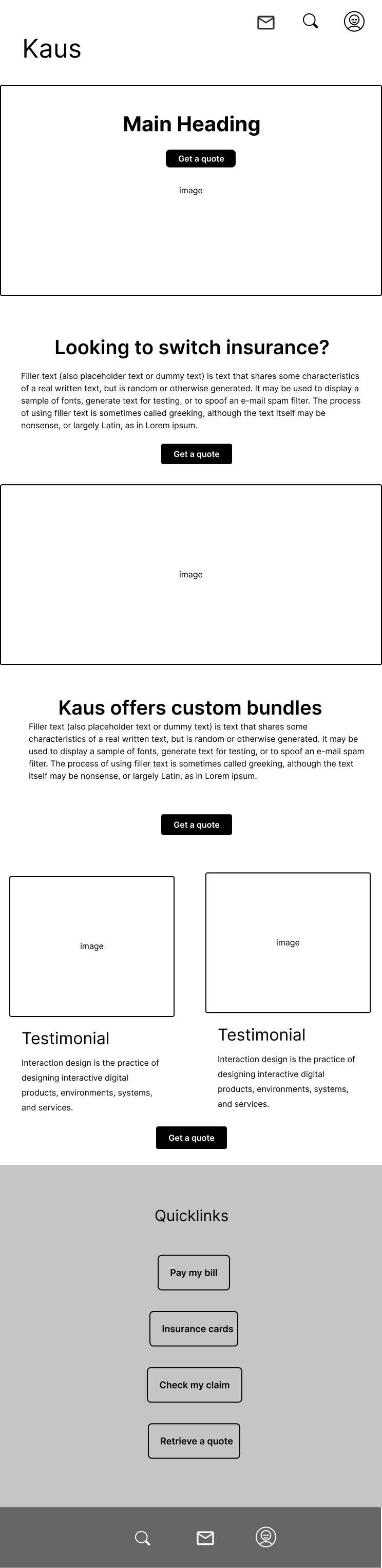
Wireframes
I used multiple CTA’s to give users several opportunities to get a quote, Shelter’s most important goal.
Initial sketches used a simple layout incorporating images and testimonials. I used design ideas from other insurance websites and added large images. User reviews on the homepage provided validation for moving forward with the quote. I later adjusted the design including a quick links section for tablet and mobile and a larger footer.
Initial sketches

Responsive wireframes

UI Kit
Reliable, Strong, Secure, Protect and Renew were important words that I pulled from user interviews and guided Shelters branding and UI.
I generated the name “Shelter” from the key words and then brainstormed logo and color ideas. Imagery of historical sturdy brick buildings informed the initial designs but later evolved into a simpler line logo. I chose to use all caps to further the idea of strength.
Trust, access, dependable and inviting were concepts that guided the UI for Shelter. I built the color palette around a blue grey, selecting lighter colors and a gradient to give the site a fresh, youthful feel. Photos all received a gradient overlay to unify the design.
Usability Tests
Usability tests uncovered various issues: users needed more support choosing coverage, and were hesitant to share their personal information in the checkout process.


Users worried about putting in their personal information before getting a quote. I added these elements to address it:
Reorganized the quote process so that users put in their information last, instead of first, aiming to build trust first.
Added a summary screen to show all their selection on one screen before checkout.
Added a notification about privacy to remind users that their information is never shared.
Users needed help selecting coverage.

After
I defined all the buttons with color and added more description and a link to chat with a customer service rep while making selections under the options section.
Before

50% of users commented on the success screen at the end of the process.
After

I changed the text to add a personal connection and also an available action for users.
Before

Multi-step form
The original form was iterated on over several rounds of testing. From the landing page, users could select which type of insurance they wanted, then select the details of the coverage, complete their personal info, receive a summary of their choices and then decide whether they wanted to save the quote or purchase it.
Prototype
Impact & Outcomes
After working on iterations I was able to acheive a 100% completion rate for purchasing insurance.
Users are accustomed to particular visual ways of defining things, including the way buttons look. I used some of these conventions to make a multi-step form easier to navigate.